The Challenge
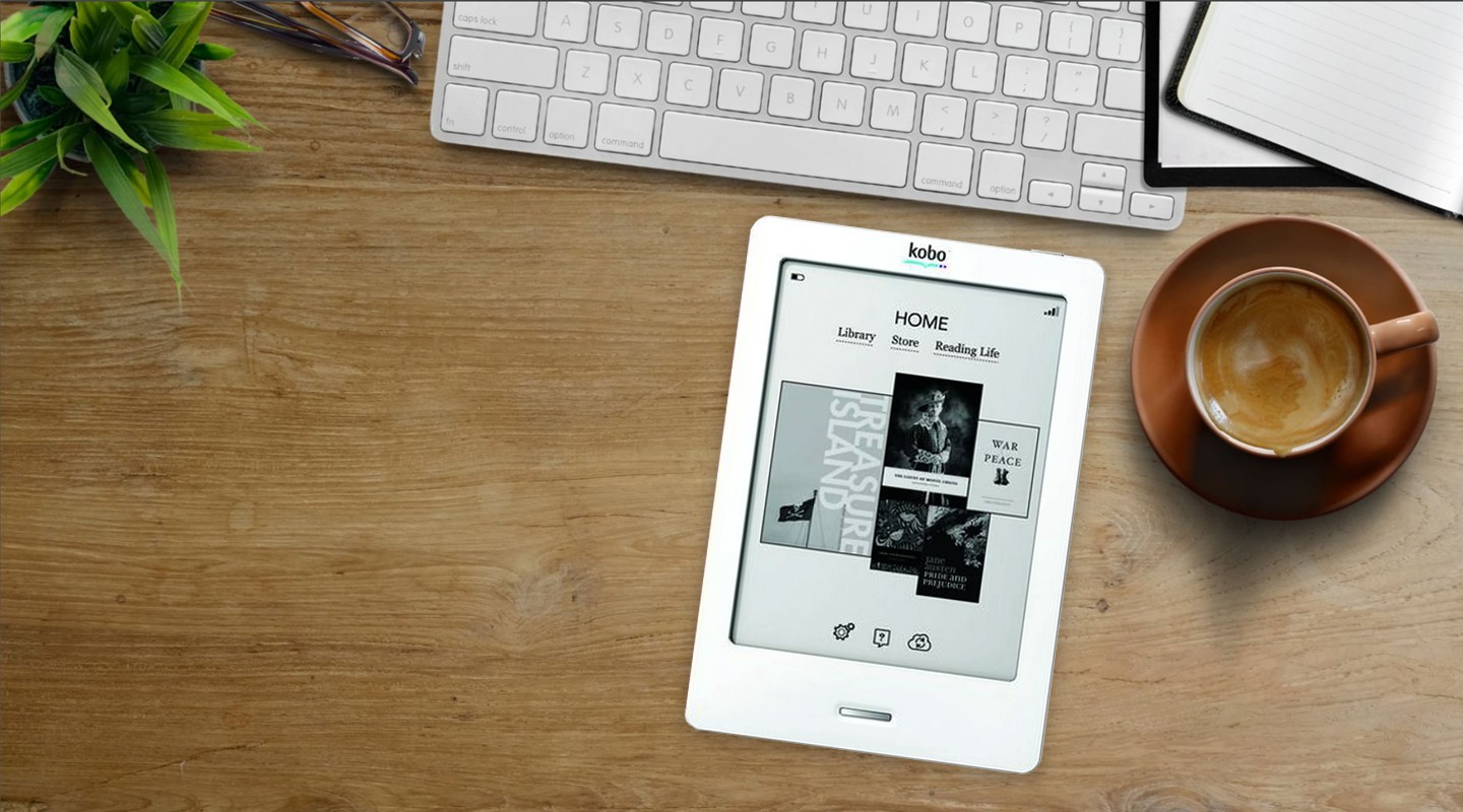
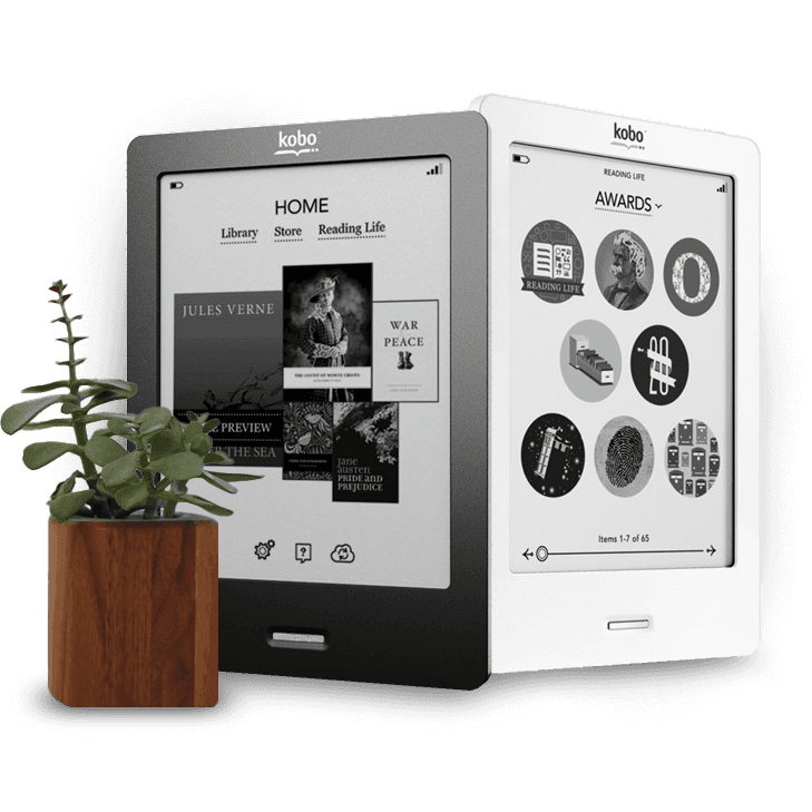
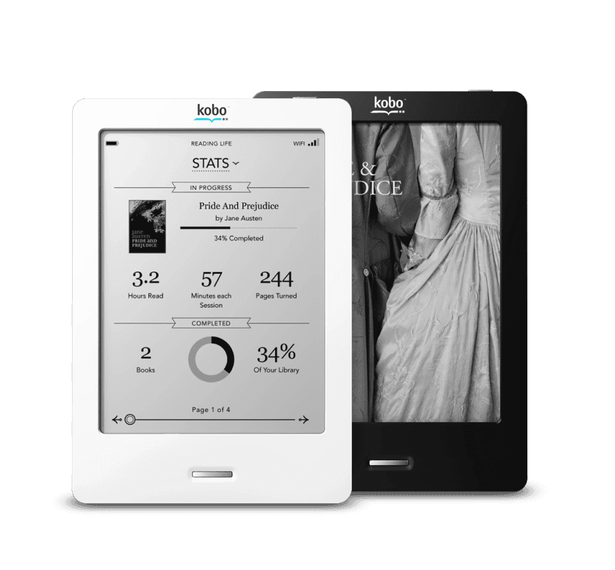
E-ink technology has some limitations. These devices use only black and white and the refresh rate is slow which means that animations are out of the question. The UI had to be pixel perfect and very detail oriented to be effective.
First Time Experience
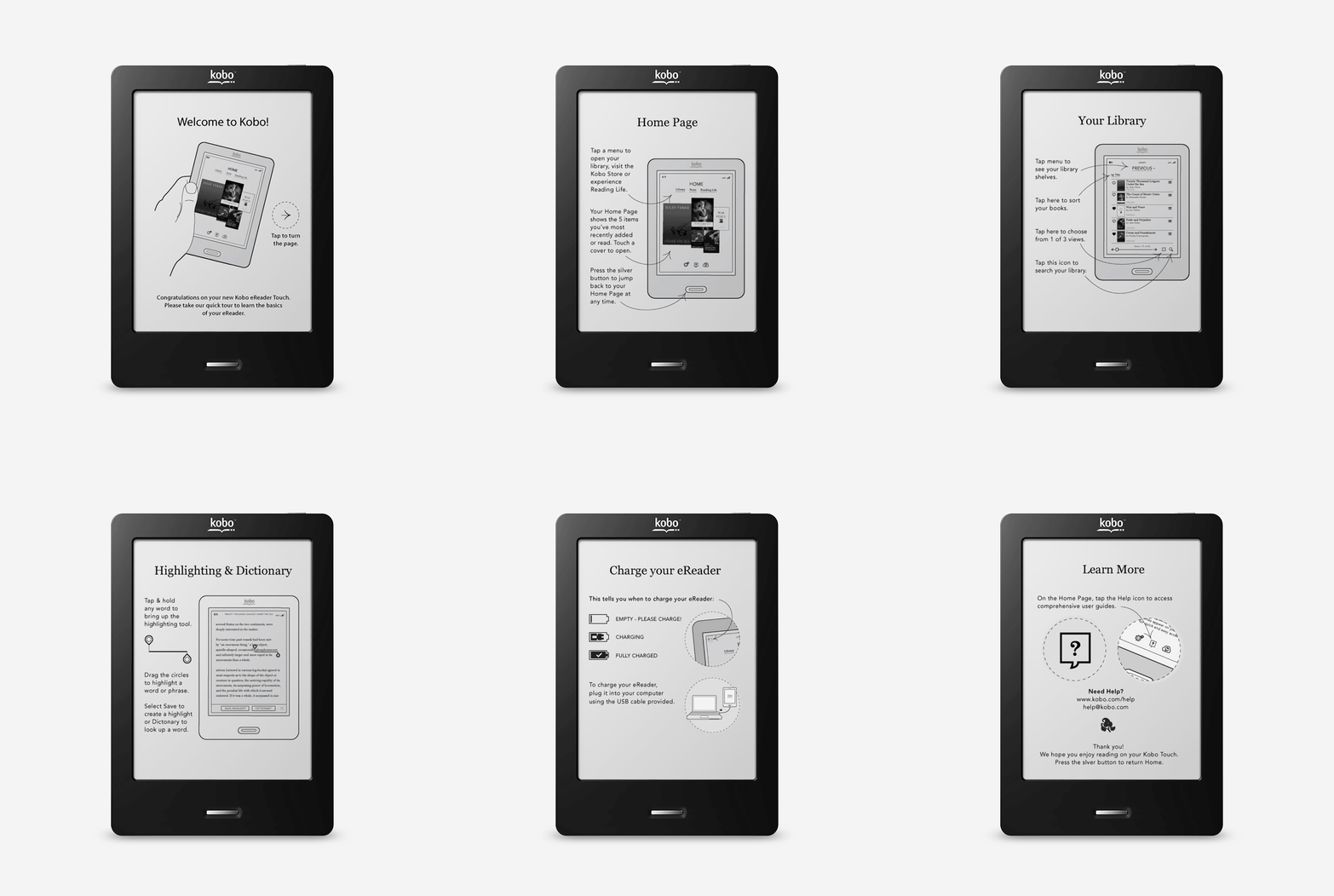
I’ve always had a fascination for the first time experience of software. Although good software should be intuitive and easy to use there is often a quick onboarding experience that helps the user get started. One of my tasks was to put this together for the Kobo Touch. The Challenge was to teach a user how to use an e-reader. By this time, everyone was well versed in using tablets so a hand held device was common, however eReaders were still pretty unique to the common user. Colour and video were traded for long batter life and a screen you could read in bright sunlight, just like a regular book.
Kobo Delivered
The best part of my Kobo experience was being part of putting Kobo on the map. Kobo was just a small start up in Toronto at the time. Remarkably, the Kobo Touch, which debuted a decade ago, is still cherished by users today. In a competitive landscape dominated by giants like Amazon's Kindle and Barnes & Noble's Nook, the Kobo Touch stood out. Its minimalist design approach, which cleverly integrated the keyboard within the digital interface, was a defining feature that distinguished it from its contemporaries.

