brand
PROJECT

Redesign of a Canadian Beauty College Website

Redesign of a Canadian Beauty College Website


ROLE

Lead UX/UI Designer

Find the Pain Points and how to solve them

We did an audit of the existing site and some user testing and discovered a few issues that needed to be addressed.

Find the Pain Points and how to solve them

We did an audit of the existing site and some user testing and discovered a few issues that needed to be addressed.

Modern Office with white wall and white desk.

Find the Pain Points and how to solve them

We did an audit of the existing site and some user testing and discovered a few issues that needed to be addressed.

Montor with MC College website homeapge. In front of monitor is 2 espressos and a stove top Italian espresso machine.

Pain Point 1

Each campus had its own website, leading to redundant updates across six program pages for every change. The solution was to make a single, unified website with easy campus toggling for the user and simplified maintenance for the staff.

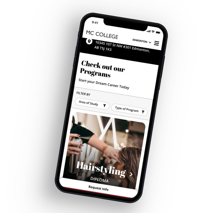
Modern Iphone with MC College website and user interface that allows user to filter programs.
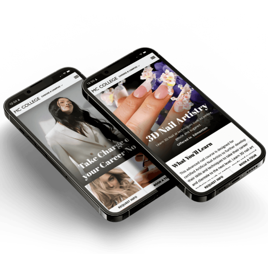
2 Modern Iphone with MC College website  pages on them. Phones are floating on angle with shadow.

Pain Point 2

Users were initially stopped at the beginning of the experience, forced to choose a campus location. This was confusing, especially for international students with no idea of geographical locations. By giving the user the ability to select a campus if and when they choose, we ensured a straight forward presentation for easy browsing and comparisons of campus offerings.

Users were initially stopped and forced to choose a campus location at the beginning of the experience. This created confusion, especially for international students with no geographical location understanding. By giving the user the ability to select a campus (if and when they choose) we ensured a straight forward presentation for easy browsing and comparisons of campus offerings.

Pain Point 3

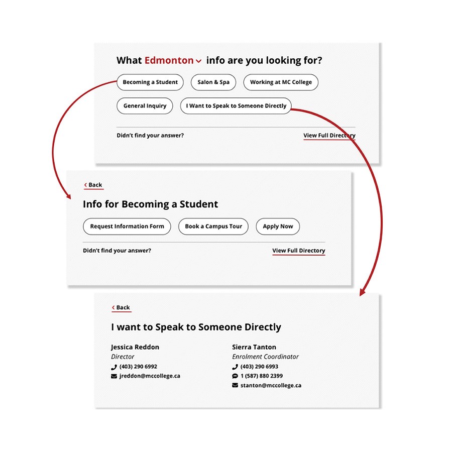
The Contact form was overwhelmed with inquiries, with many users asking about information readily available on the website. We created a new contact wizard to guide users to information, resulting in an increase in quality leads, easing admin workload.

The contact form was overwhelmed with inquiries, with many users asking about information readily available on the website. We created a new contact wizard to guide users to information, resulting in an increase in quality leads, easing admin workload.

3 screens with arrows displaying unique solution for contact page to direct users to information they need easily.
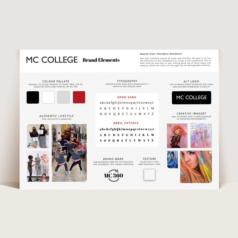
Mood board with colours, logos, branding patterns, imagery and textures.

Optimized Design Hierarchy

A clear visual hierarchy helps users navigate your website more easily, allowing them to find the information they're looking for quickly and efficiently. This also ensured we could guide users' attention to key areas, such as calls-to-action ultimately leading to more qualified leads.

The old site was difficult to scan. Titles did not stand out and bold, upper-case and coloured text was found throughout the pages. We introduced a clear visual hierarchy to help users find information quickly and efficiently. We also ensured clear CTAs were used in appropriate places, which resulted in an increase in qualified leads.

Mobile-First

Approach

Mobile-First Approach

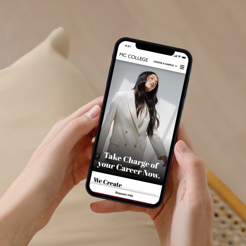
Our target audience was predominantly using handheld devices so we did rigorous testing for a flawless presentation and a thumb-friendly sticky CTA for easy engagement.

phone in hands of user on homepage.

© Copyright 2024. All Rights Reserved. XⓋX

© Copyright 2024. All Rights Reserved. XⓋX

© Copyright 2024. All Rights Reserved. XⓋX